Unless you just entered the workforce this morning, you’ve probably seen a few PowerPoint slideshows like this. And if you’ve sat through a live talk featuring this sort of PowerPoint, you’ve probably thought, “Will anyone notice if I leave?”
PowerPoint might be the most misused tool in the workplace. We use it as a teleprompter. (Looks like he’s going to read each slide to us. So glad I came.) We use it as a Word document, cramming paragraphs into each slide. (Actually, I hope he does read to us – from my seat, I can’t see any of the words on the screen.) Or we use it as a handout, to help our audience follow along. (How nice. This talk has subtitles.)
But if you follow a few simple suggestions, you can use PowerPoint to create presentations that powerfully communicate your ideas – and even inspire your audience.
1) Put less information on each slide
Silicon Valley investor Guy Kawasaki created the “10/20/30 Rule of PowerPoint.” This simple formula states your presentation should be no more than 10 slides, last no longer than 20 minutes, and have no text smaller than 30-point font.
The first two rules probably aren’t relevant to you. Kawasaki created this formula for entrepreneurs pitching him for venture funding. He chose 10 slides because he likes to see business ideas presented in a specific way. And he chose 20 minutes because he doesn’t want to sit in those meetings for two hours!
But the third rule – 30-point font minimum – is a useful guide for any presentation you create, for two reasons. First, it’s easier for an audience to read larger text onscreen. Second, forcing yourself to use large text is a clever way to make sure you’re placing only the most important words and phrases in your slides.
2) One idea per slide
Contrary to Kawasaki’s 10-slide rule, it’s okay to have many slides in your presentation – as long as each one is clear, advances your argument and communicates a single thought or idea. I’ve seen PowerPoint presentations that ran over 100 slides – but were powerful and even captivating.
The trick is to use each slide to tell its own little story – with visuals, if possible – and to keep the story moving quickly.
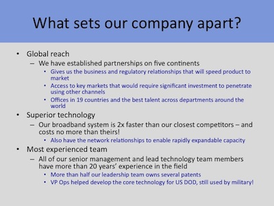
Don’t shove a bunch of different points and thoughts into each slide (as I’ve shown in the slide at the beginning of this article). That all-too-common formula – bullet, sub-bullet, sub-sub-bullet – will make your presentation come across cluttered and boring – and your audience will start wondering how to get out of the room without being noticed.
3) Just give us the headlines (and maybe some subheads)
PowerPoint is a presentation vehicle, but it is not the presentation itself. That means your slides should support and amplify your verbal presentation – but should not contain every word of your talk. Keep text on your slide short enough that your audience can absorb it in a second or two.
Think of each slide as a billboard. You have to communicate your idea (using words, imagery or both) immediately or your audience will drive right by. So just give them the headline – and maybe a key subhead.
Say you’re giving a presentation to summarize department spending in the previous quarter. If you want to make the point that year-over-year spending was down 14%, you could create a slide with an enormous “Spending down 14%!” across the center. Perhaps you’ll want an image of a happy face, a thumbs-up or a party hat alongside the message, to underscore the good news. But that’s it – one idea on the slide.
In your talk, you can break down specifically in what areas and dollar amounts your team saved over last year’s budget. But putting all those details on the slide will only weaken the visual impact of “Spending down 14%!”
Note: sometimes you will be asked to deliver information using PowerPoint, but without a live talk. If you’re asked to “send over a presentation” to describe the quarterly budget, as in the example above, you can include additional detail in the “Notes” section below each slide. You can also create “Appendix” slides at the end of the presentation, and reference them in your main slides. These techniques let you keep each slide clean and powerful.
4) Use imagery
Bestselling author Seth Godin argues that communication is the transfer of emotion. One of the great advantages of PowerPoint is that each slide gives you a blank canvas to tell your story. And as Godin points out, a single image can communicate more emotion than all the text you can squeeze into a slide.
If you’re using PowerPoint to convey the ecological dangers of pollution, you could list bullet after bullet of statistics about species harmed or the number of gallons of waste illegally dumped. Or you could show a dead bird covered in toxic sludge.
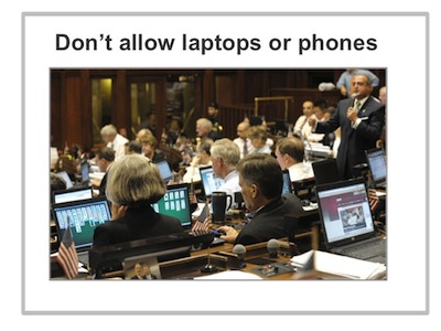
Here’s a slide I created for a seminar called Leading Effective Meetings. One of my guidelines for creating better meetings is not to allow computers or cell phones in the room. I could have listed data about distracted attendees and lost productivity due to computer use in meetings. Instead I made my point with this image – of the Connecticut State Legislature in session. An actual depiction of the problem, combined with some humor, made the case much more powerfully.
Note: use real imagery, such as photos from Corbis or iStockPhoto. They’re inexpensive (just a few dollars per image), excellent quality, and the sites make it easy to quickly find the type of image you’re looking for. Do not use clipart or other silly, cartoonish illustrations. Also, do not use any of the colorful design patterns PowerPoint offers as backgrounds. These elements look amateurish and undermine the seriousness and power of your presentation.
5) Ask yourself, Am I really creating a Word document?
Sometimes you will start creating a PowerPoint presentation and notice quickly that with each slide you feel compelled to list bullet after bullet (and sub-bullets and sub-sub-bullets) of data, and large blocks of text to explain those data.
If this happens, you might want to stop and ask yourself if you’re using the right tool. Perhaps you could more effectively communicate this information in an Excel spreadsheet or a Word document. Or perhaps you simply need to have a meeting to discuss the information you’re trying to cram into your slides.
That’s okay. You’re better off figuring this out now, and switching tools, than building a clunky, hard-to-read PowerPoint presentation that doesn’t allow you to present your content as clearly or persuasively as you’d like.
6) Don’t place your agency’s name and logo on every slide
This might seem like a nitpick complaint, but placing your logo on the bottom of every slide weakens your presentation in several ways. It physically consumes a good portion of each slide’s real estate, leaving you less room for the slide’s single idea. It also adds clutter, which lessens the visual impact and weakens the emotion of every message you communicate in your presentation.
And really, does your audience (or whomever you’re emailing your PowerPoint file) need to see the Department of Education logo 32 times in your 32-slide presentation?
The only place in your PowerPoint pr
esentation for your agency’s logo is the title slide. Once you’ve moved on to slide two, assume everyone in the room knows what agency you represent – and get on with telling a great story!
You probably have your own ideas about how to make a more effective PowerPoint presentation. We could all use the help! So let’s open the discussion.