What is a Quilt Chart?
Quilt Investment Charts are visual representations of financial asset categories that demonstrate diversification’s importance for an investment portfolio. A period such as 10 years is used to portray how the performance of each asset category varies relative to the other asset categories from year to year.
Each asset class is portrayed annually on the chart by a distinctive color. Because each asset class has a unique color and often performs differently each year, the resulting depiction is like that of a quilt that employs different patches of cloth. If an investor holds a basket of these squares consistently and over a long period, the result can be a bountiful harvest of positive returns.
Financial asset quilt charts can help us understand the value of diversification but cannot be used to predict the future. Actual quilts, however, which are composed of layers of fabric with a filler material have contributed to an interesting part of our nation’s history. Some cloth quilts were instrumental in providing actual details on directions to slaves hoping to escape.
Quilts were used in the 1800s by African Americans to navigate the underground railroad network. Certain patterns portrayed on quilts helped direct other slaves to freedom. The codes provided a way to communicate something to a person in the presence of many others without others knowing. Howard University’s Professor Raymond Dobard states, “It was a way of giving direction without saying, ‘Go northwest.'” For more information, read National Geographic’s article, Did Quilts Hold Codes to the Underground Railroad?.
Ben Carlson is a Chartered Financial Analyst and the Director of Institutional Asset Management at Ritholtz Wealth Management. He also pens a great readable financial online column, A Wealth of Common Sense.
Among the traditions he shares every year is sharing his opinion on a quilt chart for financial asset categories. You can see his 10-year financial chart and read about it at Updating My Favorite Performance Chart for 2022.
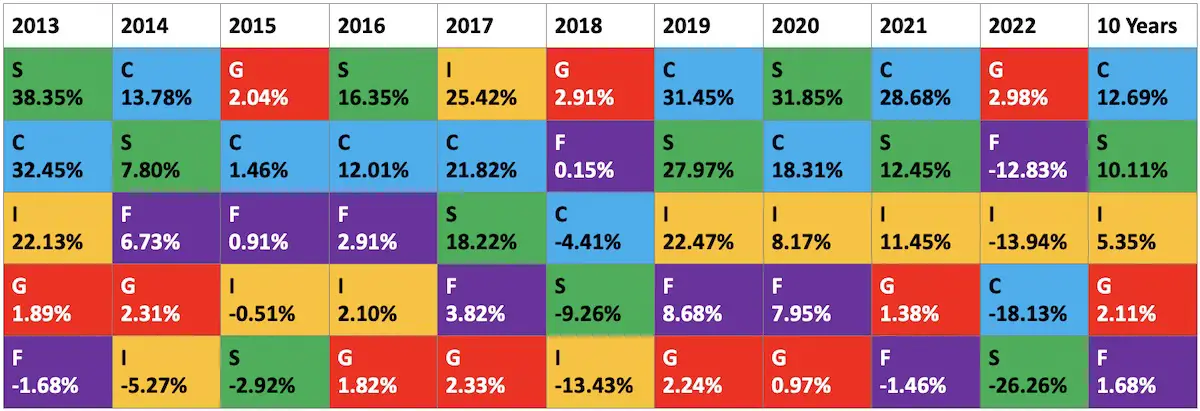
A Quilt Chart of the Core TSP Funds
I have not been able to find an online quilt chart for the Thrift Savings Plan five core funds. So, I spent some time and created one as shown below.
What is the Value of a Quilt Chart?
Again, financial quilt charts are not meant to be a tool for predicting where the best allocation may be for the current year. Using a quilt chart to source current or future asset allocations would be akin to using your rearview mirror or a map of where you have been to pilot your financial future.
The value of a quilt chart is to remind us that diversification should be embraced as a key to your retirement portfolio’s long-term success. Think of diversification as a strategy for spreading your money among different types of investments, which reduces risk while still allowing your investments to grow. It is one of the most basic principles of investing.
The G Fund and Risk Management
The ten-year TSP quilt chart I created for you in this article also reinforces the emotional roller coaster ride of how even an asset class like the G Fund may be the front runner among the TSP family of funds in a year like 2015 but then drop down to last place twelve months later.
To be sure, the G Fund has never gone negative, unlike the other four funds. If a person had invested solely in the G Fund for the past 10 years, she or he would have had a very safe TSP portfolio. But how would it feel to be invested in it and only it for the past 10 years?
Would you be happy with an average annual return of a little more than 2%? Do not forget the reality of inflation. Risks are part of preparing for your retirement. Too much safety insulates you from market volatility but denies your portfolio the growth needed to fuel your future retirement.
Mark Zuckerberg took a big risk to drop out of Harvard to create Facebook. Here is his advice on risk: “The biggest risk is not taking any risk. In a world that is quickly changing really quickly, the only strategy that is guaranteed to fail is not taking any risks.”
TSP Lifecycle Funds
What the TSP quilt chart also reinforces is that investing your TSP contributions and matching contributions for the long term may best be served by using a Lifecycle Fund. An advantage of those choices is you accept an expected risk and return that is appropriate to the time horizon that is appropriate for you.
Every three months the allocations of the ten target date Lifecycle Funds automatically adjust their allocations composed of the five TSP Funds. This gradually shifts the allocations to a lower risk and reward profile. Eventually, all the Lifecycle Funds are retired. The end state for the Lifecycle Fund is the L Income Fund. “The L Income Fund’s investment objective is to achieve a low level of growth with a high emphasis on the preservation of assets,” according to the TSP.
The L Income Fund is designed “if you are currently withdrawing money from your TSP account in monthly payments.” Some financial consultants see the L Income fund as too conservative. Others view it as not safe as the G Fund. The L Income fund did go negative in 2008 and 2022. It has averaged a little over 4% a year since its inception in 2005.